4 min read
Websites are becoming more adaptive
Responsive layouts still matter, but screen width is only one condition. Interfaces may also need different navigation, input methods, contrast and content priority across devices. Adaptive components help a website remain clear without forcing every visitor through the same presentation.
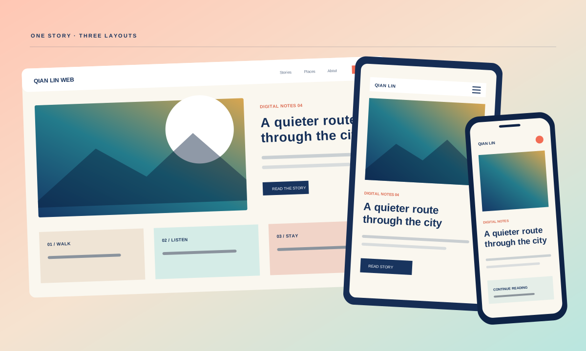
Responsive layout is the baseline
Breakpoints rearrange a page, but adaptation also covers input method, reading order and the amount of information visible at once. A desktop menu may become a focused mobile menu, while a dense comparison may need labels repeated so it remains understandable without its original columns.
Start with the jobs each page supports at different widths. A phone visitor may need directions, a price or a short enquiry form, while a desktop visitor may compare several options. Both should receive the same essential facts, but controls and supporting detail can be arranged for the available space and input method.
Responsive acceptance should cover more than three screenshots. Test narrow and wide phones, zoomed desktop, landscape orientation and intermediate widths where headings or navigation wrap. Use final translations and real validation messages. A component may fit at 390 pixels yet fail at 430 because a label stays on one line or a card changes column count. Check the ranges between named breakpoints, not only the endpoints.
Content priority is more than stacking columns
Design component behaviour for touch, keyboard and pointer use as part of the same system.
The important content should remain recognisable across sizes. Moving a primary action below several secondary sections on mobile changes the journey even if every element technically fits. Responsive review should therefore compare priorities, not only check whether boxes overflow.
Tables, filters and multi-step forms deserve their own responsive decisions. Shrinking a desktop component often hides labels or creates horizontal scrolling. A mobile version can repeat context, group related fields or reveal detail on demand, provided the underlying information and available actions remain consistent.
Reading order must remain logical when columns collapse. Visual placement on desktop can differ from source order, which affects keyboards and screen readers. Review the DOM sequence, focus movement and announcement of expanding content. Repeat labels when a comparison becomes stacked. A compact mobile presentation may hide secondary explanation behind an intentional control, but essential price, scope or error information should remain available without an undisclosed gesture.
Navigation must work for touch, keyboard and pointer
Keep content hierarchy stable even when navigation and layout change between devices.
Touch targets need space, keyboard users need a visible focus order and pointer interactions need a usable alternative. Hover-only controls and horizontally clipped navigation often appear late unless each input method is included in the acceptance checks.
Keyboard and touch checks reveal different failures. Menus must stay open while focus moves through them, dialogs need a predictable close action and controls need labels that remain understandable without hover. Testing these behaviours on complete page journeys is more useful than checking isolated components in a catalogue.
Input method changes the interaction design. Hover can add feedback for pointer users, but it cannot be the only way to open navigation or reveal required information. Give touch controls enough separation, maintain visible keyboard focus and keep menus open while focus moves through their items. Test dialogs and drawers with Escape, outside clicks and the browser back action where appropriate. These behaviours need written acceptance, not visual inference.
Test complete journeys with real content and translations.
Real copy exposes problems that placeholder text hides. Longer translations, validation messages, empty states and product names should be tested before launch. A component system is useful when it records these behaviours instead of treating every screen as a separate mock-up.
Practical checks
- Translations should be part of responsive acceptance because labels and headings expand differently across languages. Test the longest supported copy, error messages and empty states at narrow widths. If one translation breaks a control, adjust the component or wording without hiding information that other language versions provide.
Review the complete navigation and content journey at desktop and mobile widths with the copy that will actually be published.
Content priority should follow the mobile task without creating a different offer. If contact details move upward on a phone, the desktop version still needs an obvious route. If a comparison becomes an accordion, preserve headings and state. Review analytics or support evidence where available, then document deliberate differences. Adaptive design works when each presentation is usable and recognisably part of the same information system.
Related service