3 min read
Four web design mistakes that make a business look less trustworthy
Trust is weakened by inconsistency, unclear ownership and missing information long before a visitor evaluates visual polish. These recurring design mistakes are observable and can be corrected without inventing testimonials or performance claims.
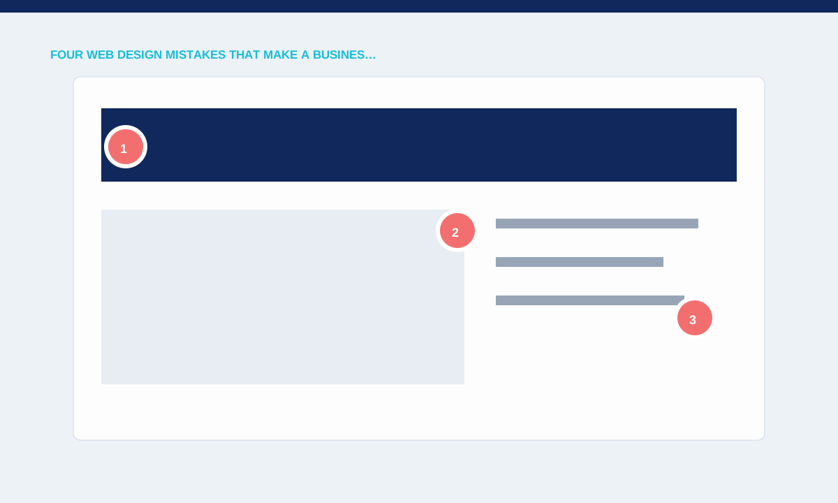
Unclear identity and contact details
Visitors look for a consistent name, domain, contact route and explanation of who provides the service. Different brand names in metadata, footer and form emails make an otherwise polished site feel unfinished.
Check the header, footer, legal pages, confirmation messages and structured data for one current identity.
Identity details should agree everywhere a visitor checks them. Compare the header, footer, contact page, legal pages, confirmation messages and search metadata. A different company name or inactive email address makes the site feel abandoned. Add a clear explanation of who provides the service and where the business can be contacted. These facts do more for credibility than an unsupported row of logos.
Vague offers and hidden scope
Large slogans cannot replace concrete service information, deliverables and boundaries. A visitor comparing suppliers needs to know what is included, what affects price and how to start.
Review every service page for a plain description, relevant exclusions and a working next step.
Replace broad claims with information a buyer can evaluate. State what the service covers, the starting price where one exists, important exclusions and the steps required to request a quote. Put qualifications beside the relevant claim rather than hiding them in an FAQ. When visitors understand the scope, they can decide whether to continue without interpreting slogans or opening several unrelated pages.
Inconsistent components and weak states
Buttons, spacing, forms and feedback should behave predictably across the site. A form that changes labels or provides no error explanation creates doubt at the moment of enquiry.
Test keyboard focus, validation, loading, success and failure states on desktop and mobile.
Audit component behaviour as well as appearance. Buttons with different labels should not perform the same action unpredictably, and a form must explain loading, success and failure. Test focus, validation and menu state with keyboard and touch input. Small inconsistencies become most visible when someone is ready to enquire, so include these interaction states in the same review as typography and spacing.
Unsupported proof
Stock logos, invented metrics and anonymous testimonials can damage credibility instead of adding it. Concept work is useful when its status is explicit and the design decisions can be explained.
Practical checks
- Label concept and reference material clearly; publish only claims that the business can substantiate.
Evidence needs a clear identity. Label concept projects, internal tools and temporary reference assets exactly as they are. Remove invented results, anonymous praise and client marks that cannot be supported. A smaller portfolio with honest context is more credible than a larger grid that implies relationships the business never had. Explain the problem, work and project status so the reader can judge relevance directly.
Related service