3 min read
How to structure a business website homepage
A useful homepage identifies the business, helps the right visitor find relevant information and offers a credible next step. The section order should follow the questions people need answered, rather than a universal template.
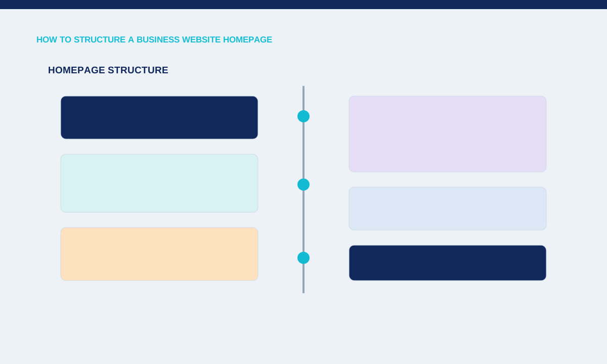
State the offer and audience
The opening needs a recognisable service, audience and action without relying on an abstract brand line. A clear heading and short explanation let visitors decide whether to explore services, work or contact.
Compare the hero with the page title and primary navigation; remove competing claims that describe different businesses.
The opening section should identify the service, intended customer and useful next action without requiring a scroll. Supporting copy can mention the main project types or limits that help someone self-select. Keep the heading specific enough to distinguish the business from a generic agency. Test it without the hero image; the offer should still be understandable when media loads late, is blocked or is viewed through assistive technology.
Help visitors choose a path
Service summaries should organise decisions without forcing every detail onto the homepage. Three clear service groups with descriptive links can be more useful than a long grid of overlapping capabilities.
Group services by buyer need, link to deeper pages and preserve the same labels throughout navigation.
Organise services around customer decisions. A short overview can link to detailed pages for business websites, e-commerce, web applications or support. Each option needs a practical description and relevant boundary, not a different slogan. Avoid putting every capability in the first screen. Visitors should be able to choose a direction, then open the page that answers scope, process, examples and pricing questions in more detail.
Provide appropriate evidence
Work examples, process details and clear boundaries help visitors judge fit. A new studio can show labelled concept work and explain its approach without inventing client results.
Choose proof that can be verified and place it near the claim it supports.
Proof should appear near the claims it supports. Use clearly labelled project work, interface examples, process details or verifiable operating facts. If the portfolio contains concept work, say so beside the item. Testimonials and performance figures require evidence and permission. The homepage can still be persuasive without them by showing the quality of the work and explaining how enquiries, milestones, revisions and handover are handled.
End with a specific next step
The final section should tell people what information to provide and what happens after contact. A project form, email and quick WhatsApp option can serve different levels of urgency without replacing one another.
Practical checks
- Test every contact path and keep the expected response process consistent across the site.
Close with a realistic contact path. Explain what information helps produce a useful reply, how the visitor can send it and which alternative channel is available for a quick question. Keep legal and privacy links in the footer and make contact details consistent. Review the full mobile order so the primary action does not move below repetitive promotional sections or disappear behind a menu interaction.
Related service