4 min read
Performance is now part of design
Page weight, image choices, JavaScript and animation all shape how a design feels. Core Web Vitals make those trade-offs visible, especially on mobile connections. Performance decisions now belong in the layout and interaction review, rather than being left until launch.
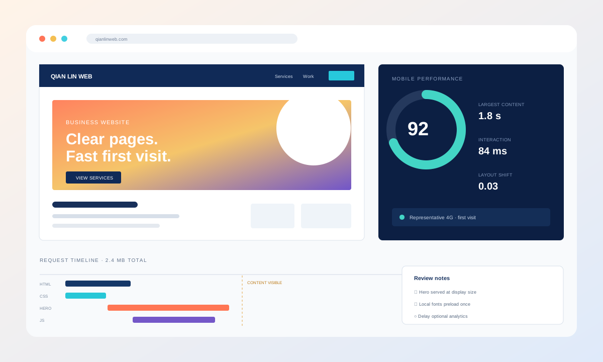
A design file does not show loading cost
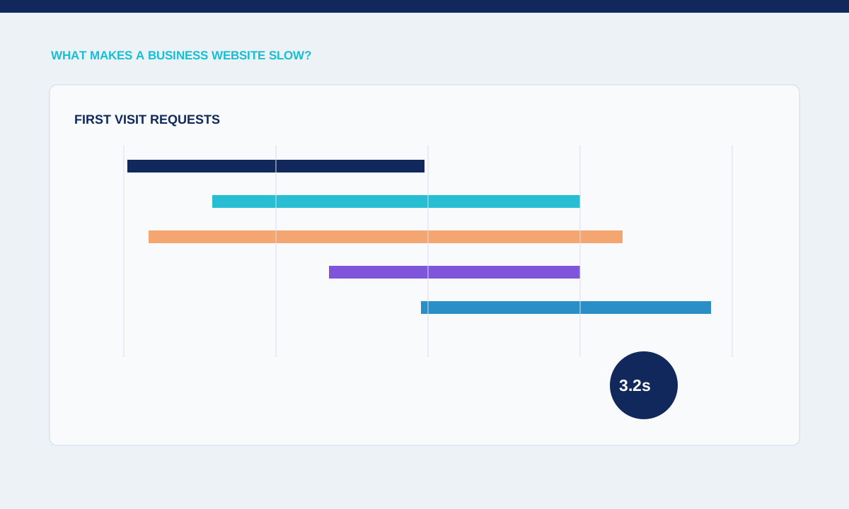
A page can look restrained in a design file and still load slowly once large images, several font files, animation libraries and third-party scripts are added. Performance review therefore needs the real page, representative content and a device or connection close to what visitors actually use.
Agree a page budget while the layout is still flexible. The budget can cover the hero image, font files, third-party scripts and interaction code that must be ready for the first view. Designers can then decide which visual elements carry enough value to justify their loading and rendering cost.
Set performance expectations by template and device. The homepage, service page, article and application screen have different content, so one fast route cannot represent the whole site. Use the same test conditions before and after a change and keep the result with the page version. Lab measurements help diagnose, while field data reflects actual visitors; neither should be quoted without explaining its source and coverage.
Prioritise the page’s main action
Review important content, media and scripts together instead of treating speed as a final technical task.
The first visible heading, key image and primary action usually deserve the earliest network and rendering priority. Material further down the page can wait. This order helps visitors understand the page while the browser continues loading supporting media and optional interaction.
Loading order follows the visitor's task. A service page normally needs its heading, offer and primary action before a gallery or embedded map. An article needs readable text before decorative media. Marking every image as urgent competes for the same connection and can delay the element that matters most.
Prioritisation starts with the content needed to understand the page. The main heading and essential text should not wait for optional scripts. Give the likely largest visible image correct dimensions and delivery priority, then lazy-load media further down. Avoid marking every image as urgent. On article and catalogue pages, readable structure can appear while secondary images, recommendations or embedded services continue loading.
Review images, fonts and JavaScript separately
Test representative mobile conditions before approving expensive motion or third-party embeds.
Images, fonts and JavaScript create different costs. Images need appropriate dimensions and formats; fonts need deliberate weights and subsets; JavaScript needs a reason to run. Grouping every problem under one performance score makes it harder to identify the change that will help.
Performance work should identify a cause rather than chase one score. A slow server response, oversized hero image, blocking font and long JavaScript task need different fixes. Compare traces from the same route and device profile, then verify that the change improves the visitor's experience without removing required functionality.
Fonts and animation also affect perceived speed. Limit families and weights, load only necessary character sets and provide fallbacks with compatible metrics. Animation code should run after the required layout exists and respect reduced-motion preferences. Check whether pinned or transformed sections create large paint areas on mobile. The goal is to keep the intended visual direction while removing work that does not contribute to the visitor's task.
Test the first visit on representative mobile conditions.
Measure the first uncached visit as well as repeat navigation. Check layout movement, interaction delay and the largest visible element on mobile. Keep the tests tied to actual templates because a fast test page does not prove that a media-heavy service or article page performs well.
Practical checks
- Keep a small set of representative pages in the release check: the homepage, a media-heavy service page, an article and any form or store journey. New content and third-party tools can change performance after launch, so these pages should be checked again when templates, tracking or major assets change.
Agree the performance and acceptance checks before implementation so the finished page can be tested on real devices.
Include performance in release and content workflows. An editor can undo careful development by uploading an oversized image or embedding several external widgets. Document image dimensions, video handling and approved third-party tools. Recheck representative pages after template, tracking or campaign changes. When a regression appears, record the responsible asset or script so the fix is specific and does not become a general request to simplify the whole design.
Related service