3 min read
How brand colours and typography affect website trust
Colour and type influence legibility, recognition and the apparent care behind a business website. The practical work is choosing a system that survives real content, accessibility requirements and everyday updates.
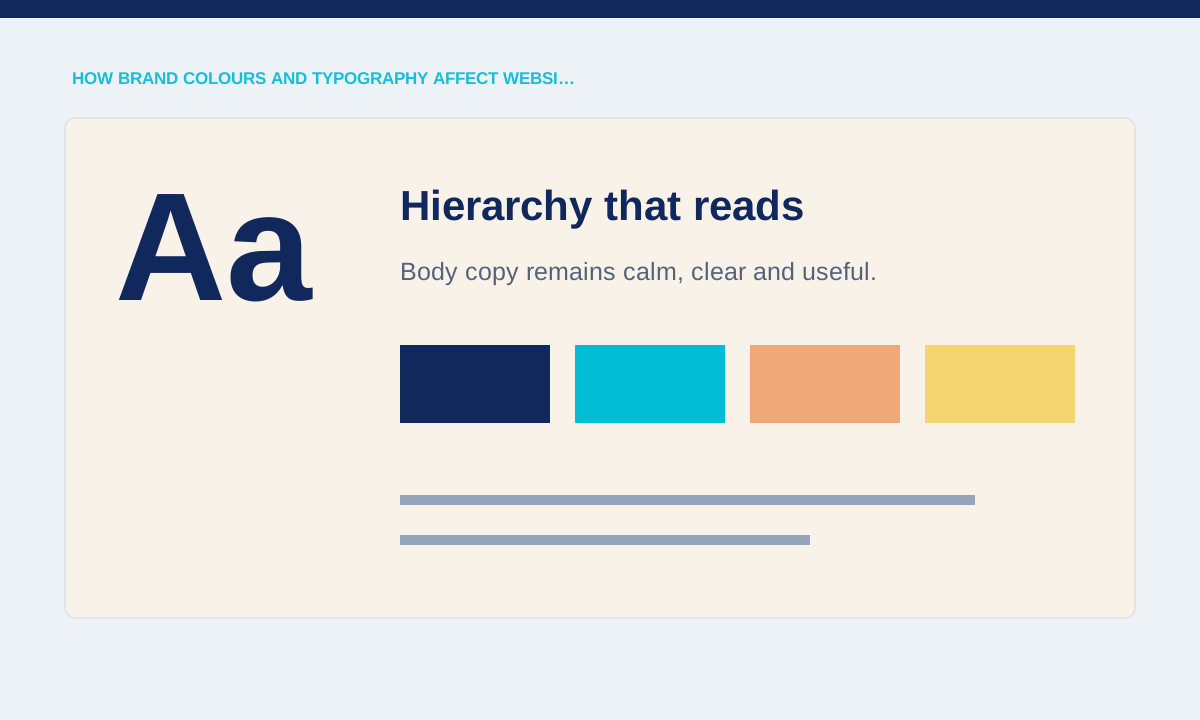
Trust starts with legibility
Visitors cannot evaluate an offer they struggle to read, so contrast, type size and line length are functional decisions. A pale brand colour can remain part of the palette while a darker related tone carries body text and important controls.
Test text, links, disabled states and form feedback against their actual backgrounds at common screen sizes.
Legibility checks should use the smallest real text, not just the largest headline. Review navigation labels, prices, captions, consent text, error messages and links on every background they can appear on. Test the page in bright and dim conditions and at browser zoom. A distinctive palette can remain expressive while darker tones handle important text and controls. The goal is to prevent visitors from guessing where to read or click.
Typography needs clear jobs
A reliable system assigns roles to headings, body copy, labels and data instead of choosing a different treatment for each section. The expressive typeface can lead short headlines while a quieter face handles pricing, legal copy and instructions.
Count the weights and styles in use, remove decorative variants that add no hierarchy and check language-specific characters.
Typography earns trust through predictable roles. Limit the number of font families and weights, then define where each is used. A display face may suit a short hero but become tiring in instructions or legal copy. Check numerals, currency symbols, accents and Chinese characters before approving a font package. Loading only the required files also reduces the chance that text shifts while the page is becoming visible.
Colour should communicate state consistently
Interface colours often need to show actions, warnings, success and selection in addition to carrying the brand. If the primary brand colour is also used for errors and inactive controls, people must guess what each state means.
List every semantic state and confirm that colour is supported by text, shape or position rather than acting alone.
Colour needs a semantic layer beyond the brand palette. Decide how the interface shows primary actions, selected filters, warnings, errors, success and unavailable states. Do not rely on hue alone; add labels, icons, shapes or position so the meaning survives colour-vision differences and low-quality screens. A state inventory is useful because it exposes conflicts, such as the same red being used for both a promotion and a failed payment.
Review the system with ordinary pages
A palette that works in a presentation may fail on a long service page, dense FAQ or checkout. Testing only the hero hides repeated links, subtle borders and content combinations that visitors see further down.
Practical checks
- Apply the system to one long page, one form and one mobile flow before approving it for the full build.
Test the system on a long, ordinary page before approving it. A homepage mock-up rarely includes dense FAQ text, repeated links, disabled form controls, tables or several levels of headings. Build one representative service page and one mobile form using final copy. If the hierarchy stays clear without adding new styles for each section, the system is ready to scale across the rest of the website.
Related service