3 min read
Brand identity vs website identity: what should stay consistent?
A website should recognise the same business as its other materials without forcing every page into one rigid layout. This guide separates durable brand rules from interface decisions that need room to adapt.
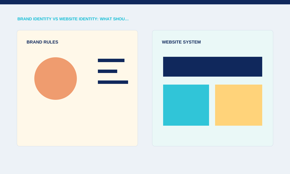
Separate durable brand rules from page decisions
Names, logo usage, core colours and voice usually need continuity, while page modules and interaction patterns respond to the task. A campaign landing page may use a tighter hierarchy than an About page while still using the same type, colour and tone system.
Compare the website with proposals, social profiles and sales documents; note which differences look intentional and which look accidental.
A practical identity audit starts with the places where customers already meet the business. Compare the website header, proposal template, social profile, invoice and email signature. Differences are not automatically problems, but each one should have a reason. If the company name, offer or contact details change between channels, resolve those facts before discussing a new visual direction. The website cannot create consistency around information the business has not agreed.
Translate identity rules into interface rules
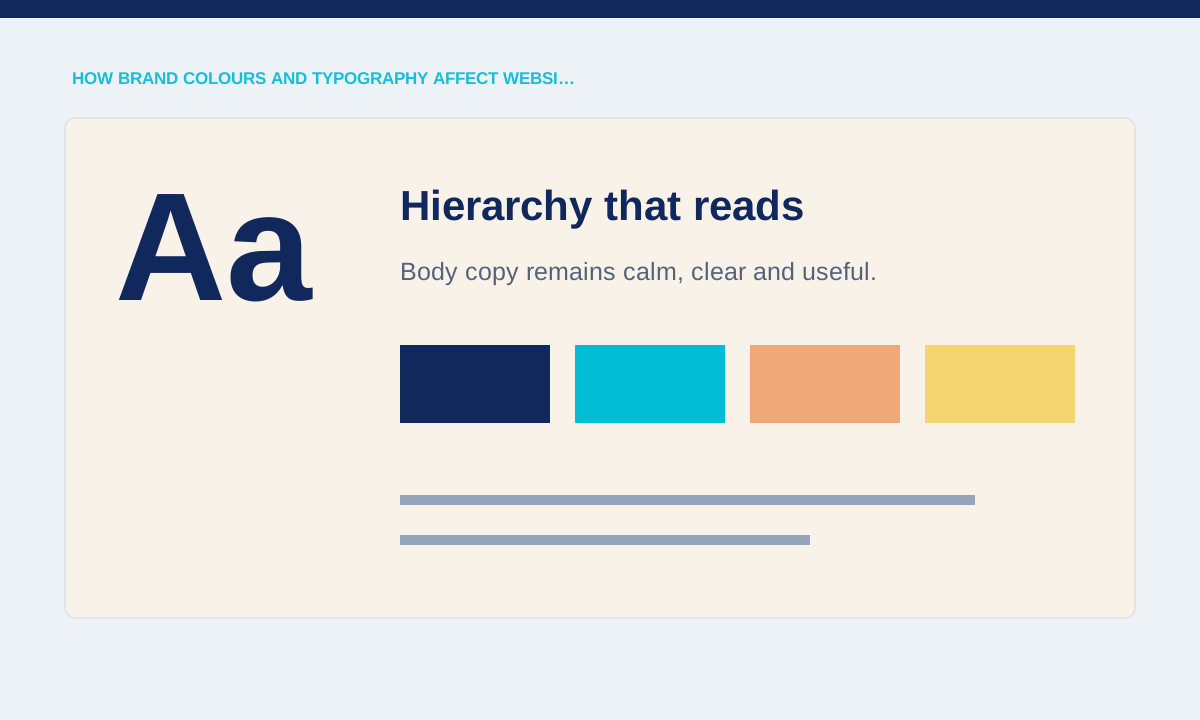
A brand guideline becomes useful online when it explains contrast, responsive logo behaviour, typography roles and image treatment. A desktop lock-up may need a compact mobile version, and a display typeface may require a more readable companion for forms and long text.
Check navigation, buttons, headings, forms, error states and downloadable files instead of judging only the homepage hero.
Turn the brand guide into decisions a browser can render and a content editor can repeat. Specify text and background combinations that meet the required contrast, minimum logo sizes, heading and body roles, link treatment and the image crops allowed at narrow widths. Include examples of errors, form feedback and disabled controls. These ordinary states reveal whether the identity works as a usable interface rather than only as a presentation cover.
Keep consistency without making every page identical
Consistency comes from repeated decisions, not from copying one composition across the site. Service pages can share spacing, labels and calls to action while changing their content order to match different questions.
Audit recurring components and exceptions; remove one-off styles that have no documented purpose.
Shared components provide consistency while page structure responds to intent. A service page may lead with scope and proof, an article with its question and reading context, and a contact page with response details. They can still use the same type scale, colour roles, spacing tokens and button language. Review differences at the component level so deliberate variation remains possible without accumulating unexplained one-off styles.
Create a handover people can actually use
The final system should tell editors and developers what to choose when they add content later. A short component and content guide is often more useful than a large brand PDF that never describes the live website.
Practical checks
- Document approved assets, type roles, colour combinations, image direction and examples of correct mobile use.
Handover should answer the questions that appear after launch: which logo file belongs on a dark background, who can approve a new colour, how a campaign page should use photography, and which components are available in the CMS. Keep source files, export formats and usage notes together. A short guide linked to the live component library is easier to maintain than a large PDF that never reflects website changes.
Related service