3 min read
How to choose icons and graphics without making a website look generic
Icons help scanning when their meaning is familiar and their style is consistent. They become decoration when every section receives a symbol with no information role or when mixed libraries create visible inconsistency.
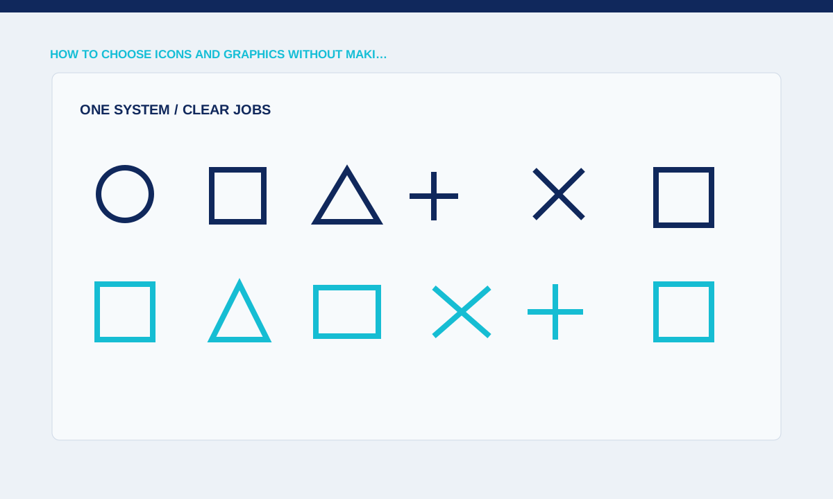
Use icons for a defined task
An icon can identify a familiar action, distinguish repeated categories or reinforce a short label. A unique abstract symbol beside every paragraph adds interpretation work without helping navigation.
Remove the icon and check whether meaning is lost; keep it only when it improves recognition or comparison.
Begin with the jobs icons need to perform. Navigation symbols, status indicators, feature illustrations and decorative marks have different requirements. Use familiar shapes for common actions and add text when meaning could be ambiguous. An icon should reduce reading effort, not create a small puzzle. Test it without colour and at the final size; thin detail that looks refined in a design file may disappear on a phone.
Keep geometry and weight consistent
Stroke width, corner shape, perspective and filled areas create a family resemblance. Mixing thin outline icons with heavy filled symbols makes a service grid look assembled from unrelated kits.
Compare icons at their actual display size and define grid, stroke and optical correction rules.
Consistency comes from a controlled drawing system. Define the grid, stroke, corner treatment, optical size and filled or outlined style. Review icons side by side at the size used in buttons and lists. Mixing several libraries often produces mismatched weight and proportions. If a library covers most needs, redraw the few missing symbols to match rather than adding a second unrelated visual language.
Do not rely on icons alone
Unfamiliar symbols need visible labels and interactive controls need accessible names. A mobile menu of ambiguous icons can block visitors who do not share the designer’s interpretation.
Test with labels, focus states, contrast and assistive technology semantics.
Graphics should carry information the surrounding copy does not already provide. A workflow diagram can show sequence and responsibility; a comparison graphic can expose differences; a product detail can focus attention on a feature. Generic floating shapes add file weight without helping comprehension. Write the intended takeaway before creating the asset, then remove labels or decoration that do not contribute to that explanation.
Plan ownership and file delivery
A usable icon system includes source files, export sizes and rules for adding new symbols. Without an owner, later additions drift in style or are copied from incompatible libraries.
Practical checks
- Record licence terms, SVG sources, naming and where each asset is used.
Handover includes accessible names, export sizes and source ownership. Decorative icons should stay hidden from assistive technology, while interactive controls need labels that describe the action. Supply SVG where it is appropriate, but inspect the code and view box before publishing. Keep editable source files and a usage index so later additions follow the same system instead of restarting the icon style on every page.
Related service