3 min read
How visual hierarchy helps visitors understand a website
Visual hierarchy signals what to read, compare and do. It comes from type, spacing, grouping, contrast and sequence working together, and it should remain understandable when content or screen size changes.
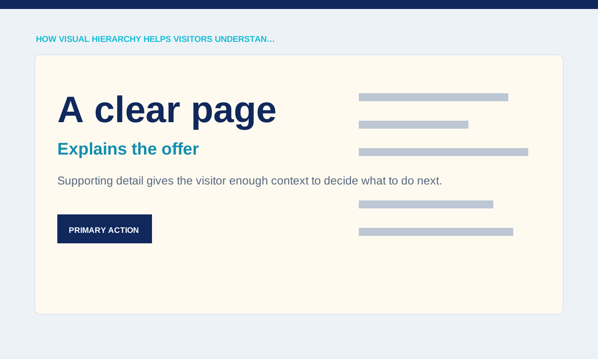
Give each level a distinct role
Headings, summaries, labels and body copy need visible differences that match their meaning. If every line is large and bold, the page has visual noise rather than hierarchy.
List the text roles in a real page and confirm that each has one reusable treatment.
Start by ranking the information on the page, then assign visual weight. The main question, essential explanation and primary action usually need more prominence than supporting labels or decoration. Size alone is not enough: position, spacing, contrast and grouping work together. View the page in grayscale or as a blurred thumbnail to see whether the intended order remains visible without reading every word.
Use spacing to show relationships
Proximity tells visitors which label belongs to which paragraph, image or action. Equal gaps between every element can make separate sections look like one block.
Review vertical rhythm at section boundaries, within cards and around buttons using actual content lengths.
Spacing shows which items belong together. A heading placed closer to the following paragraph than the previous section is easier to interpret, while identical gaps everywhere flatten the page. Use a small spacing scale and apply it consistently to sections, content groups and controls. On mobile, review how wrapping changes these relationships; a long translated heading may need space adjustments without losing its connection to the content below.
Control emphasis
Colour and size should point to the page’s priority without making secondary information disappear. A high-contrast decorative label can compete with the service name or price it was meant to support.
View the page quickly and note the first three elements noticed; compare that order with the intended journey.
Typography needs enough contrast between roles but not a new style for each sentence. Define levels for the page title, section headings, body copy, labels and metadata. Check long articles, pricing notes and form instructions as well as the homepage. If readers must rely on colour to tell a heading from a label, strengthen size, weight or spacing so the hierarchy survives different screens and accessibility settings.
Retest hierarchy on mobile
Responsive layout changes width, line breaks and element order, so desktop emphasis may not survive. A side panel can become a long block before the main content if source order is wrong.
Practical checks
- Check reading order, focus order and the placement of primary actions at narrow widths.
Actions should compete according to importance. A primary contact button, secondary information link and inline article reference should not all use the same treatment. Keep one dominant action within a decision area and use quieter links for supporting routes. Test the page with real destinations and error states. Hierarchy is successful when visitors can scan, understand and act without repeatedly returning to the top to work out what matters.
Related service