3 min read
Website images: photography, illustration or UI graphics?
Photography, illustration and interface graphics answer different content needs. The right direction depends on what must be proven, explained or imagined, and on whether the team can produce a consistent set over time.
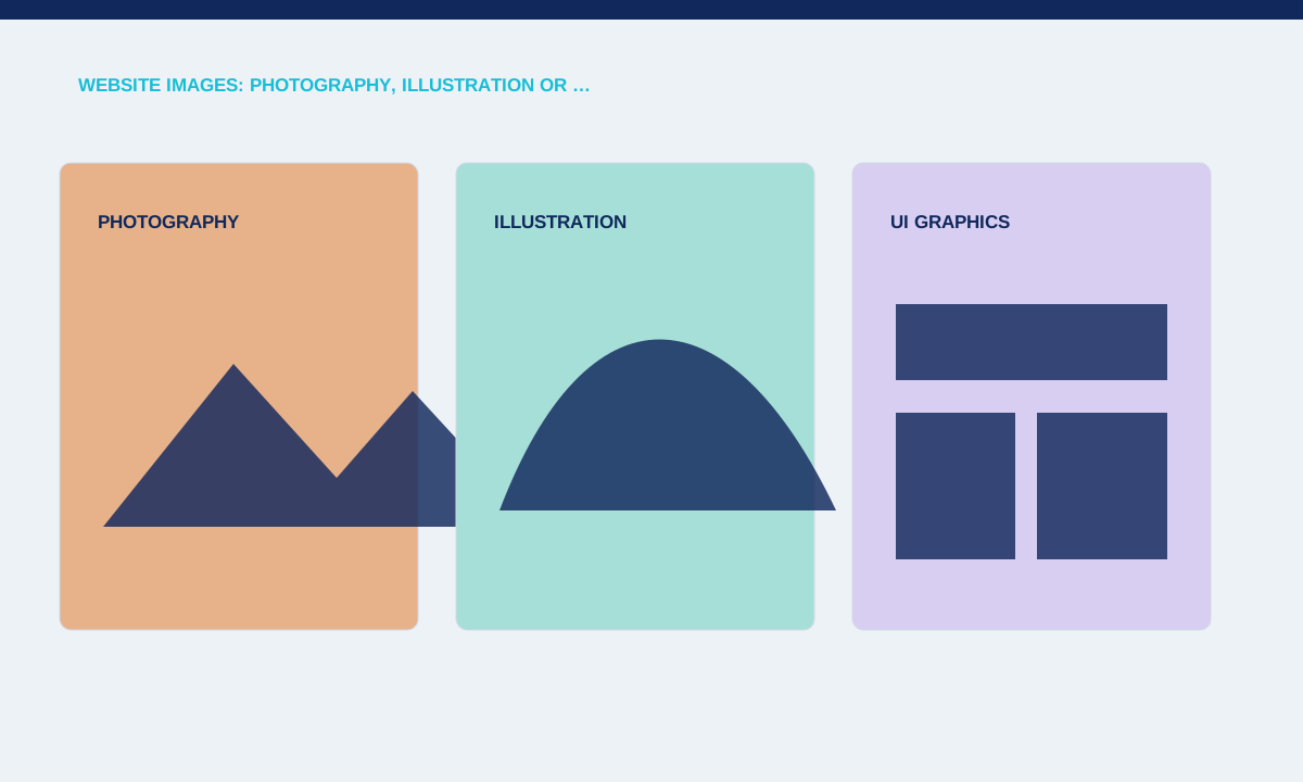
Use photography for visible reality
Photography can show people, places, products and processes that genuinely exist. Original workplace images may support a service claim better than generic people looking at laptops.
Write a shot list tied to specific page messages and confirm usage rights, crops and mobile alternatives.
Photography is useful when people, place, physical process or product detail matters to the decision. Plan subjects, lighting, orientation and required crops before the shoot. A wide hero, square card and narrow mobile image may need different compositions rather than automatic centre cropping. Record permissions and usage rights with the files so editors know which images can be published and where replacements are required.
Use illustration to explain or create
Illustration works when the subject is abstract, unavailable to photograph or needs a controlled visual language. A workflow diagram can make a software process clearer without pretending to be a real product screenshot.
Label concept material where necessary and define a style that can produce more than one hero image.
Illustration can explain an idea that cannot be photographed clearly, such as a workflow, relationship or abstract service. Set rules for line weight, perspective, texture and colour so separate illustrations belong to one system. Avoid decorative scenes that imply features or results the service does not provide. Test the asset beside real copy; it should clarify the topic without forcing the heading to explain the picture.
Use UI graphics for product behaviour
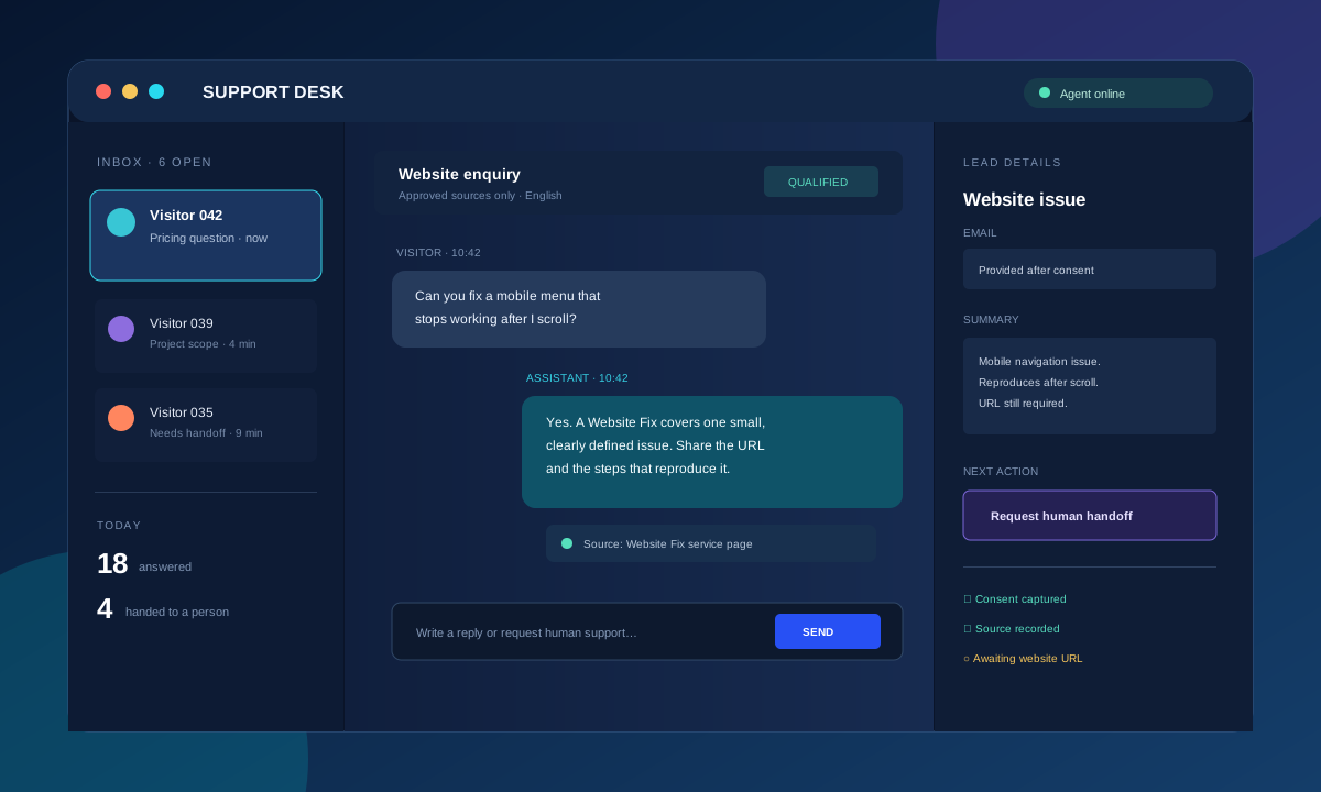
Interface visuals can demonstrate steps, states and information architecture. A focused form or dashboard detail often explains a software feature better than a full unreadable screenshot.
Use representative data, hide private information and keep text large enough to understand at its displayed size.
Interface graphics work well for software and process content when they show a meaningful state. Use representative, non-sensitive data and remove any customer information. Focus on the interaction being discussed rather than displaying a full unreadable dashboard. A close detail may explain a form, handoff or checkout better than a large screenshot. Label concept interfaces so viewers do not mistake them for a released client product.
Choose a maintainable combination
Many sites need more than one image type, but each should have a documented role. Photography for company proof, diagrams for process and UI crops for features can coexist when colour and framing are controlled.
Practical checks
- Create an image inventory with purpose, source, rights, aspect ratio and replacement owner.
Create an image brief for every template: purpose, source, aspect ratio, crop behaviour, alt-text responsibility and loading priority. Check the asset at its rendered size and on a narrow screen. Do not upload the largest original file by default. Keep filenames and ownership information organised so future editors can replace an image without breaking the intended composition or using an asset outside its licence.
Related service